· Orçun Ilbeyli
Meta catalog ad image sizes: 1:1, 4:5 and 9:16 explained
The image sizes Meta catalog ads use in Feed, Stories and Reels, where each one appears, and how to keep prices and logos clear of the interface.
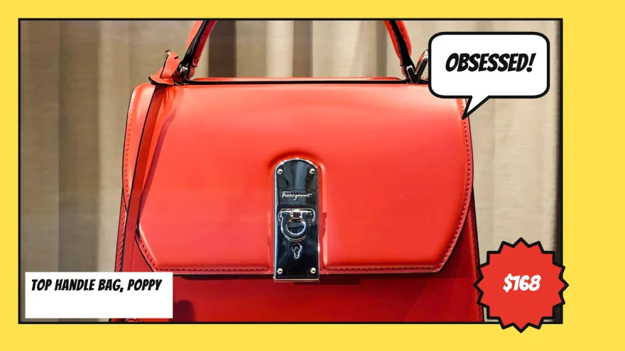
Catalog ads (Advantage+ catalog ads, once called dynamic product ads) show up in more places than any other Meta format. Feed, Explore, Stories and Reels each have their own shape, and an image designed for one of them often gets cropped badly in the others.
These are the three sizes worth designing for, and what to keep in mind for each.
The three sizes
| Ratio | Pixels | Where it shows |
|---|---|---|
| 1:1 square | 1080 × 1080 | Facebook and Instagram Feed, Marketplace, carousel cards, the catalog itself |
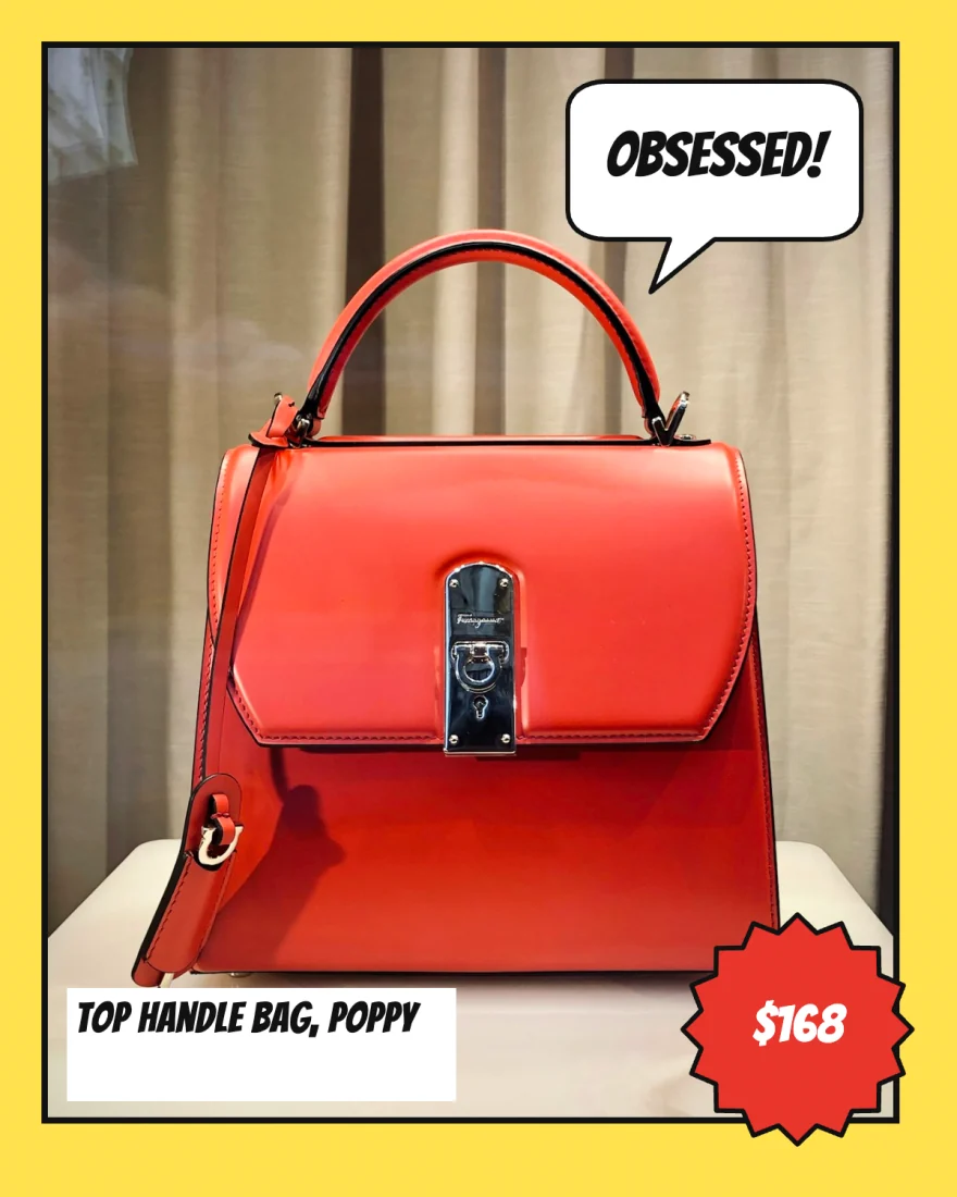
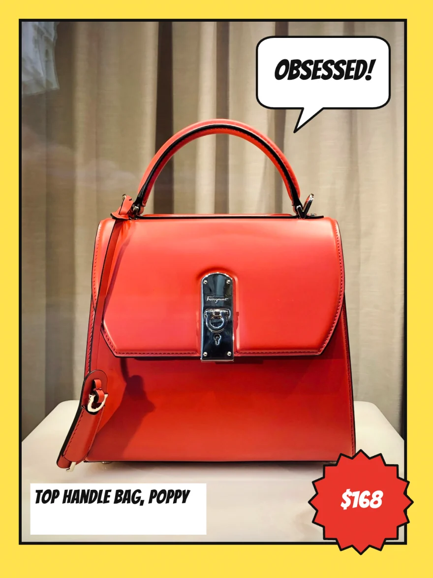
| 4:5 portrait | 1080 × 1350 | Instagram and Facebook Feed, where it takes up more of the screen |
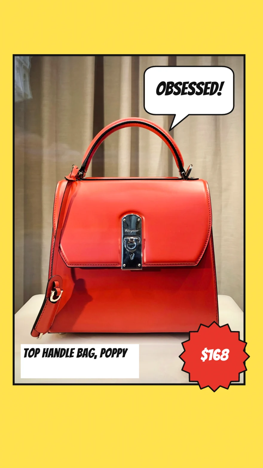
| 9:16 vertical | 1080 × 1920 | Stories and Reels |
If you only make one, make the square: it is what Commerce Manager shows for each item and what most placements can fall back to. But a square image in Stories is a small card on a blurred background, and that is a lot of wasted screen.
How the feed carries more than one size
A Meta catalog item has one main image_link and up to several additional_image_link entries. A sensible setup is:
image_link: the square ad. Commerce Manager displays it square, so nothing is cropped.additional_image_link: the portrait and vertical versions, in that order.
That is how Richicat builds its feed: every product is rendered in all three sizes, the square goes first, and the others follow.
Keep text out of the danger zones
Stories and Reels draw their own interface over your image: the profile name and progress bar at the top, the call-to-action and caption at the bottom. Meta's guidance is to keep roughly the top and bottom 14% of a story image free of text and logos.
Richicat's story templates keep the top 12% and the bottom 16% clear, and put the product name and price in the middle band where nothing covers them.
Don't crop. Re-lay out.
The quickest way to get three sizes is to crop one master image. The problem is that a headline placed nicely in a square ends up on top of the product in a 9:16 crop, or off the edge entirely.
A better approach is to keep the photo filling the frame and move the text block as one piece, so it keeps its spacing in every shape. That is what a catalog template should do for you, for every product, without anyone re-touching hundreds of files.

Checklist
- Square 1080 × 1080 as the main image
- Portrait 1080 × 1350 and vertical 1080 × 1920 as additional images
- Price and product name away from the top and bottom of story images
- One design for the whole catalog, so a price change is one update, not hundreds